White-label theming
All Drop-In UI Components (aka "Drop-Ins")can be customized across Web, iOS and Android to promote consistency in your brand.
In this guide, we discuss:
- Theming Drop-In UI Components
- Theme Definitions
Theming Drop-Ins
To change the look and feel you will need to define a collection of style variables, called a theme. The theme is passed directly into the render command of the Client SDKs. This enables different theme definitions per Drop-In instance included in your app.
<script type="module">
    import { renderW9Collection } from "https://js.withabound.com/latest-major/abound-client-sdk.js";

    // define your brand's theme object
    const yourBrandsTheme = {
        color: {
            background: "#ffffff",
        },
        shape: {
            cornerRadius: "3px",
        },
        text: {
            size: "16px",
        },
        button: {
            color: {
                activeBackground: "#655BEF",
            },
        },
    };

  	// define your brand's custom text content object
  	const yourBrandsContent = {
    		submitButton: "Complete",
  			loadingButton: "In Progress",
  			loadingPrompt: "Please Wait",
      	errorMessage: "Incorrect",
    };

    renderW9Collection({
        accessToken: "<<testAccessToken_v4>>",
        theme: yourBrandsTheme, // add your custom theme to the render method parameters.
      	content: yourBrandsContent // add your custom content to the render method parameters.
    });
</script>
import SwiftUI
import Abound

@main
struct MyApp: App {
    public static func main() {
            Abound.accessToken = "<<testAccessToken_v4>>"
        }

    var body: some Scene {
        WindowGroup {
            ContentView()
        }
    }
}

struct ContentView: View {

   private var yourBrandsTheme = AboundTheme(
        text:AboundThemeText(size:"16px"),
        color: AboundThemeColor(background: "#FFFF00"),
        shape:AboundThemeShape(componentCornerRadius: "16px"),
        button: AboundThemeButton(colorActiveBackground: "#655BEF")
    )

    var body: some View {
        Text("Tax Profile")
        TaxProfile(theme: self.yourBrandsTheme)
    }
}
Theme Definitions
Style variables are organized into three primary sections: Text, Shape, and Color.
Additionally, there are component-specific sections, such as Button, that allow for further styling that is not covered in the primary sections.
Text Style Variables
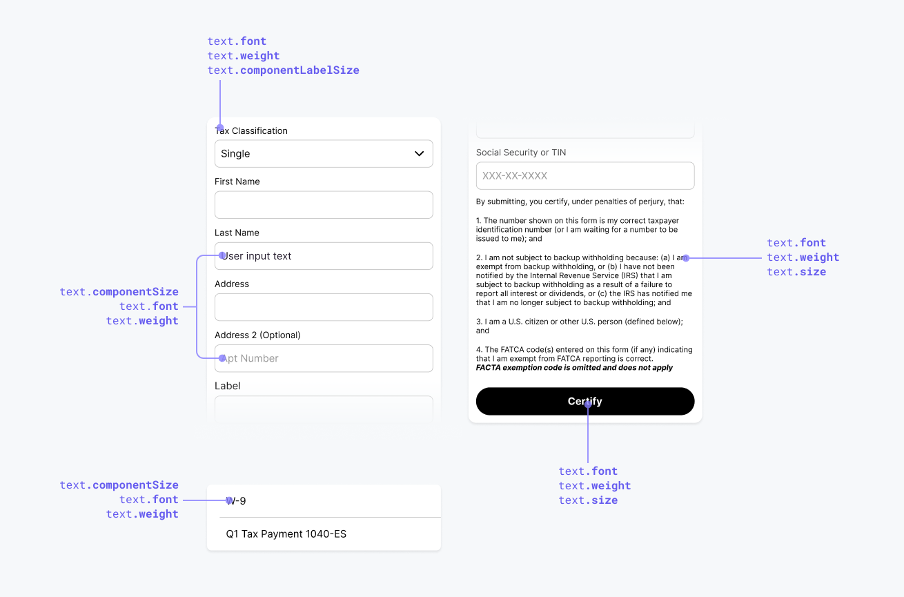
All style variables in this section are nested under the text namespace (e.g. yourBrandsTheme.text.size).
| Style Variable | Description |
|---|---|
componentLabelSize(string, default: 14px) | The text size for all component labels, such as a text-input or dropdown. |
componentSize(string, default: 14px) | The text size for all inner component texts, including the text-size of as a text-input text and . This also governs component placeholder text. |
fontFamily(string, default: Arial) | The default typography for all text in the UI Component. Options are any font supported by the app the Drop-Ins are embedded in. |
size(string, default: 12px) | The default text size for all text in the Drop-In. |
weight(string, default: normal) | The default text weight for all text in the Drop-In. Options are light, normal, bold. |
Shape Style Variables
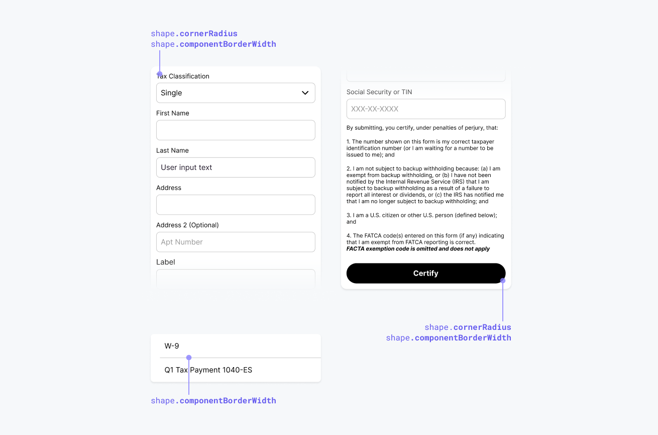
All style variables in this section are nested under the shape namespace (e.g. yourBrandsTheme.shape.cornerRadius).
| Style Variable | Description |
|---|---|
componentBorderWidth(string, default: 1px) | The default border width for all components with borders. |
componentCornerRadius(string, default: 8px) | The default corner radius for all components with borders. |
Color Style Variables
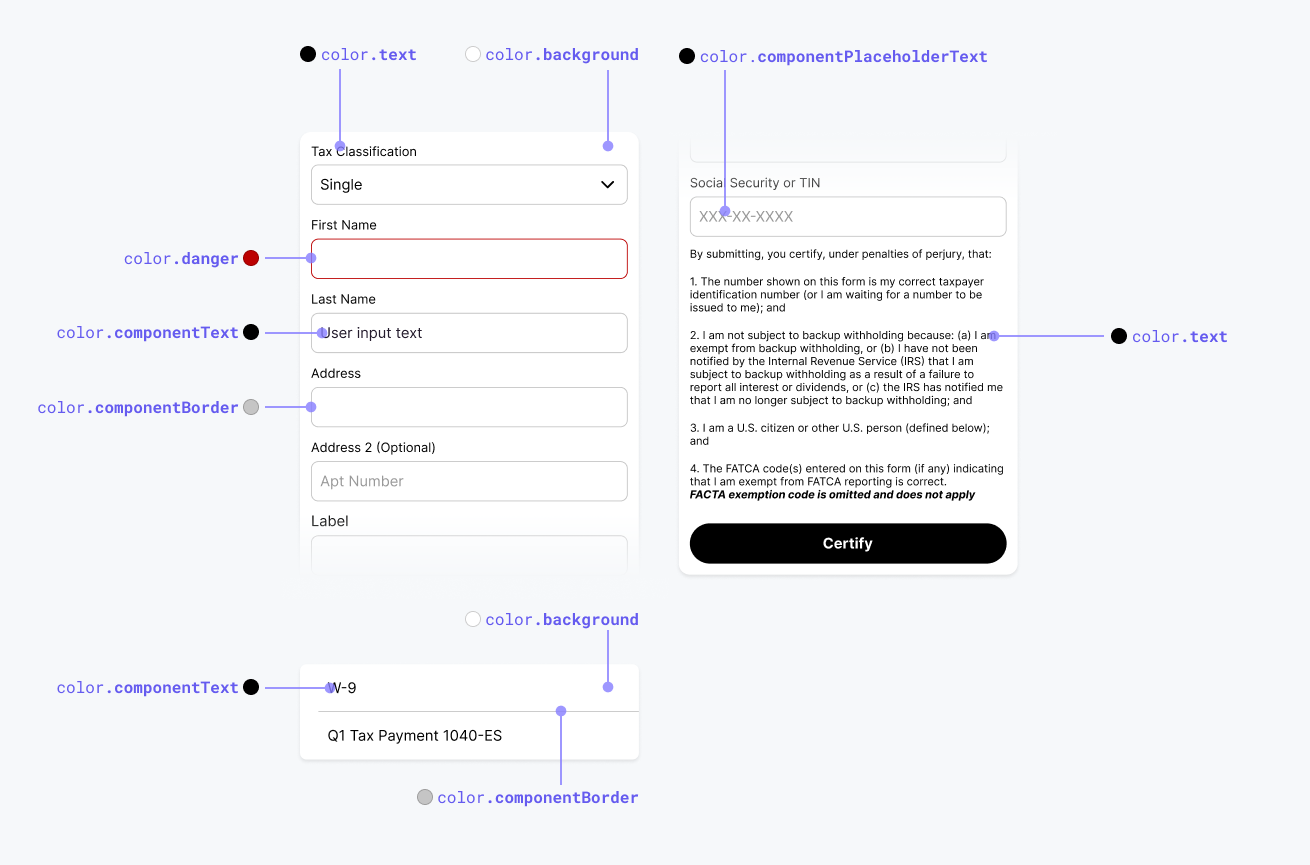
All style variables in this section are nested under the color namespace (e.g. yourBrandsTheme.color.background).
| Style Variable | Description |
|---|---|
background(string, default: #FFFFFF) | The default background color for the parent wrapper around Drop-Ins. |
componentBackground(string, default: #FFFFFF) | The default background color for all form elements. |
componentBorder(string, default: #C5C5C5) | The default border text color for all form elements. |
componentPlaceholderText(string, default: #C5C5C5) | The default placeholder text color for all form elements. |
componentText(string, default: #000000) | The default text color for all form elements. |
danger(string, default: #BC0101) | The default color for all elements in an error or warning state. |
primary(string, default: #655BEF) | The default color for all active, focused or highlighted elements. |
text(string, default: #000000) | The default text color for all text in a Drop-In. |
Button Style Variables
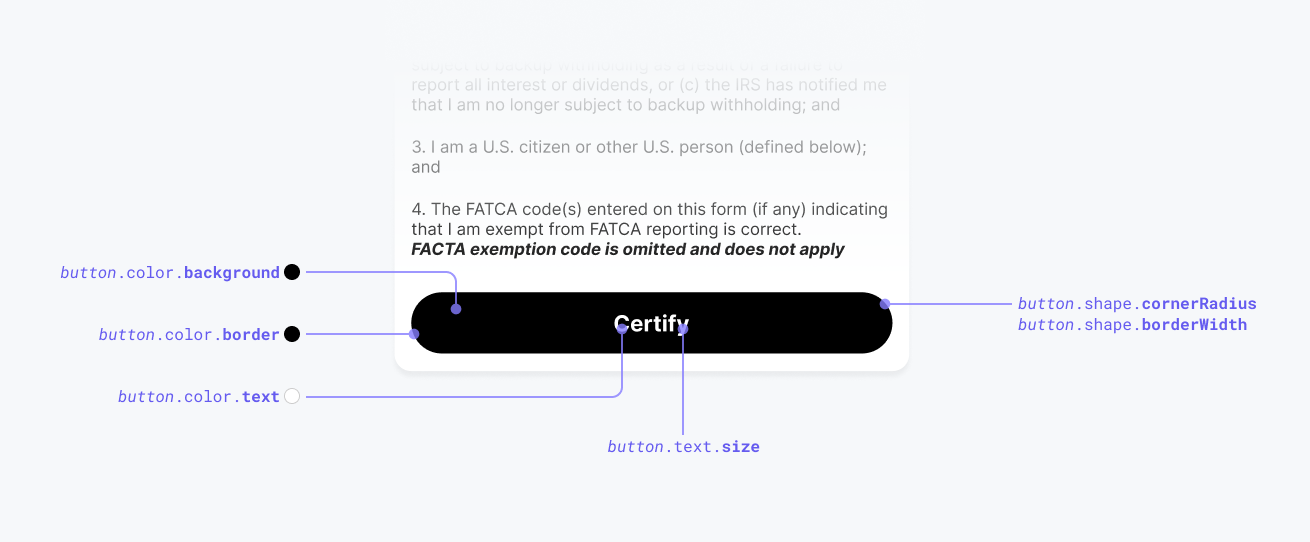
All style variables in this section are nested under the color namespace (e.g. yourBrandsTheme.button.text.size, yourBrandsTheme.button.color.border).
| Style Variable | Description |
|---|---|
color.activeBackground(string, default: #000000) | The button's background color when it's in an active state. |
color.activeBorder(string, default: #000000) | The button's border color when it's in an active state. |
color.activeText(string, default: #FFFFFF) | The button's text color when it's in an active state. |
color.disabledBackground(string, default: #C5C5C5) | The button's background color when it's in a disabled state. |
color.disabledBorder(string, default: #C5C5C5) | The button's border color when it's in a disabled state. |
color.disabledText(string, default: #FFFFFF) | The button's text color when it's in a disabled state. |
color.loadingBackground(string, default: #C5C5C5) | The button's background color when it's in a loading state. |
color.loadingBorder(string, default: #C5C5C5) | The button's border color when it's in a loading state. |
color.loadingText(string, default: #FFFFFF) | The button's text color when it's in a loading state. |
shape.borderWidth(string, default: 1px) | The button border width. |
shape.cornerRadius(string, default: 8px) | The button border corner radius. |
text.fontFamily(string, default: Arial) | The button font family. |
text.size(string, default: 16px) | The button text size. |
text.weight(string, default: normal) | The button text weight. |
Custom Content Definitions
Text content can be customized for a specific component using the content parameter. See the documentation for each component for more information.
Updated 9 months ago