W-9 Collection Drop-In
Rendering and Styling the W-9 Collection Drop-In UI Component
Using an authenticated Client SDK, you can pass in your custom theme into the render command of the W-9 Collection Drop-In.
<html>
    <head>
        <title>My App</title>
    </head>
    <body>
        <!-- target parent node to render UI -->
        <div id="abound-ui-wrapper"></div>
        <script type="module">
            import { renderW9Collection } from "https://js.withabound.com/latest-major/abound-client-sdk.js";

            // define your custom theme object
            const customTheme = {
                color: {
                    text: "#000000",
                },
            };

          	// define your custom text content object
            const customContent = {
                submitButton: "Complete",
                loadingButton: "In Progress",
                loadingPrompt: "Please Wait",
                errorMessage: "Incorrect",
            };

            // render drop-in component
            renderW9Collection({
                accessToken: "<<testAccessToken_v4>>",
                targetId: "abound-ui-wrapper",
                theme: customTheme,
              	content: customContent
            });
        </script>
    </body>
</html>
import SwiftUI
import Abound

struct MyApp: App {
    public static func main() {
            Abound.accessToken = "<<testAccessToken_v4>>"
        }

    var body: some Scene {
        WindowGroup {
            ContentView()
        }
    }
}

struct ContentView: View {
   private var yourBrandsCustomTextContent = AboundCustomTextContent(
        submitButton:"Complete",
        loadingButton:"In Progress",
        loadingPrompt: "Please Wait",
        errorMessage: "Incorrect"
    );

   private var yourBrandsTheme = AboundTheme(
        text:AboundThemeText(size:"16px"),
        color: AboundThemeColor(background: "#FFFF00"),
        shape:AboundThemeShape(componentCornerRadius: "16px"),
        button: AboundThemeButton(colorActiveBackground: "#655BEF")
    )

    var body: some View {
        Text("Tax Profile")
        TaxProfile(theme: self.yourBrandsTheme)
    }
}
You should now see the stylized UI rendered in your app:

Properties
Rendering the W-9 Collection Drop-In comes with the following properties:
| Property | Description |
|---|---|
onSubmit(optional, function) | Callback function executed when the W9 collection form is submitted and before any error or success event. |
onSubmitError(optional, function) | Callback function executed when the W9 collection form errors during submission. |
onSubmitSuccess (optional, function) | Callback function executed when the W9 collection form is successfully submitted. |
accessToken (string, required) | The user-specific accessToken. |
targetId (string, required for js) | The value of a node's id attribute where the UI will be rendered. |
theme (optional, object) | Override default styling definitions with your own brand's styling. |
content (optional, object) | Override default text content with your own brand's content. |
Custom Text Content
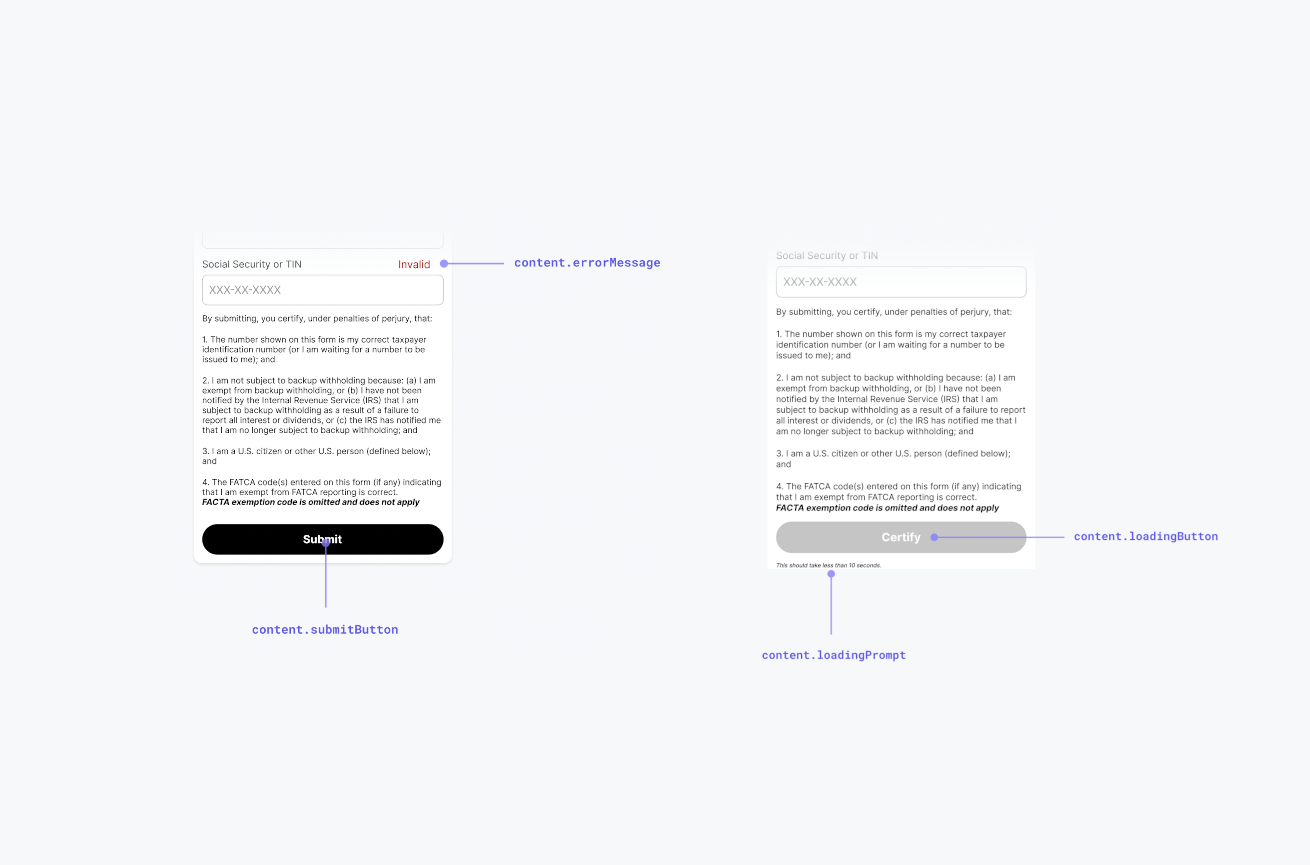
You can customize the following text content values in the W-9 Collection Drop-In using the content parameter:
| Property | Description |
|---|---|
submitButton(optional, string, default: Submit) | The text shown in the submit button. |
loadingButton (optional, string, default: Loading...) | The text shown in the submit button when the form is in a loading state. |
loadingPrompt (optional, string, default: "This should take less than 10 seconds.") | The helper text below the button when the form is in a loading state. |
On Submit Errors
Here is a list of the possible errors that are returned in the onSubmitError callback function.
| Error Type | Description |
|---|---|
| Missing Required Fields | This is shown if the form is attempted to be submitted without all the required form fields present. |
| Something Went Wrong | This is a system-failure error and should rarely, if ever, occur. |
Data Pre-population
On load, the W-9 Collection Drop-In will display (if available) the latest available W-9 information previously submitted by for this userId.

Updated 9 months ago